Back in 2022, we added a ‘freestyle text’ section on our always-evolving coffee bag labels.
The intention was to have some freedom and personality in how we presented our coffees on the retail shelves. In addition to our automated one-line attributes (process, variety, body, acidity…), we wanted a chance to share some interesting facts and stories, making each offering more ‘human’.
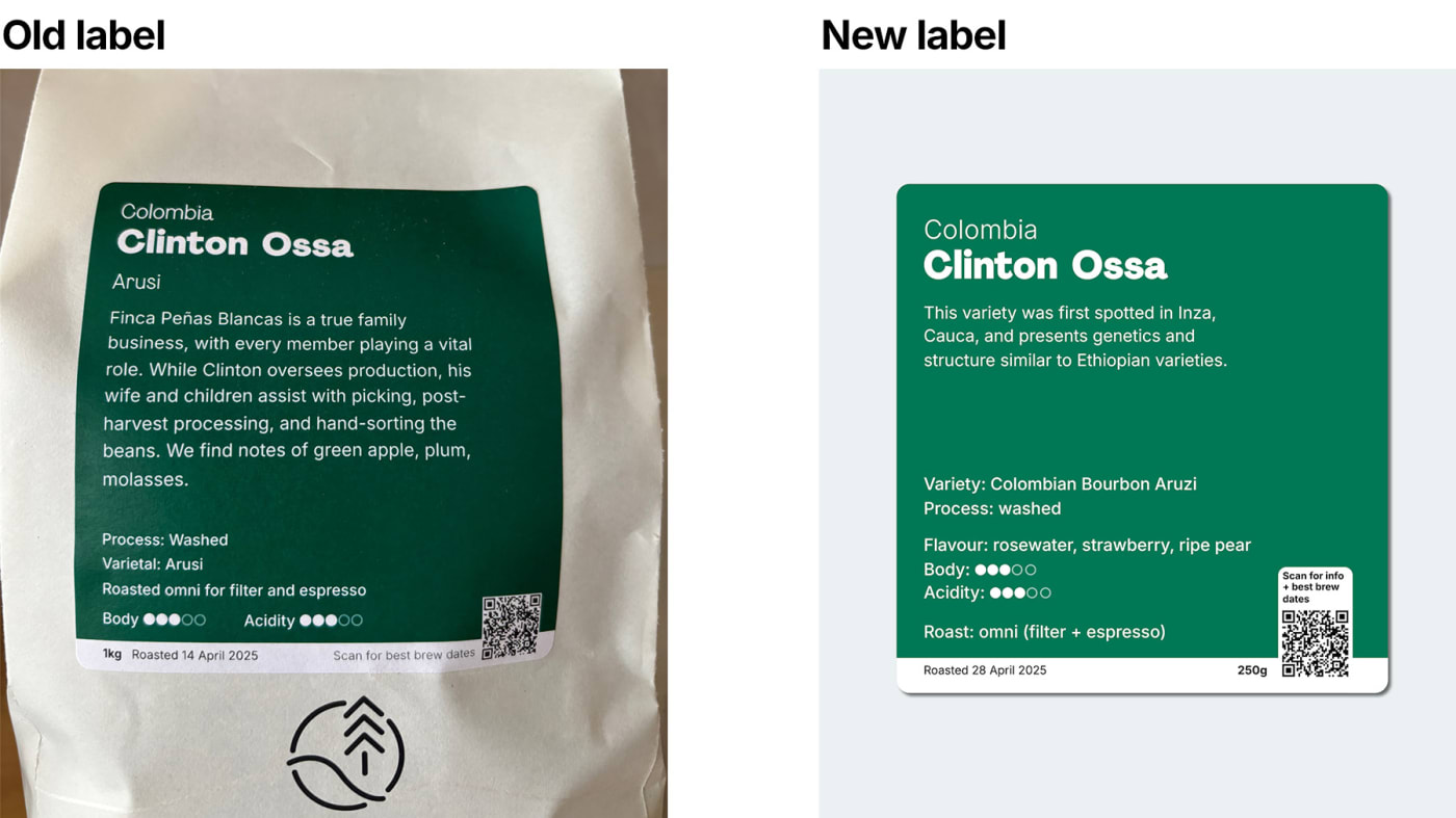
Comparing our old (2022-2024) and new (2025) label layouts
The reality was that our labels often ended up busy and wordy. Flavour profile descriptors (which are, essentially, what make our customers choose amongst our numerous origins) would get lost within the blurb.
And guess what: we all read less and less these days. We’re visual creatures.
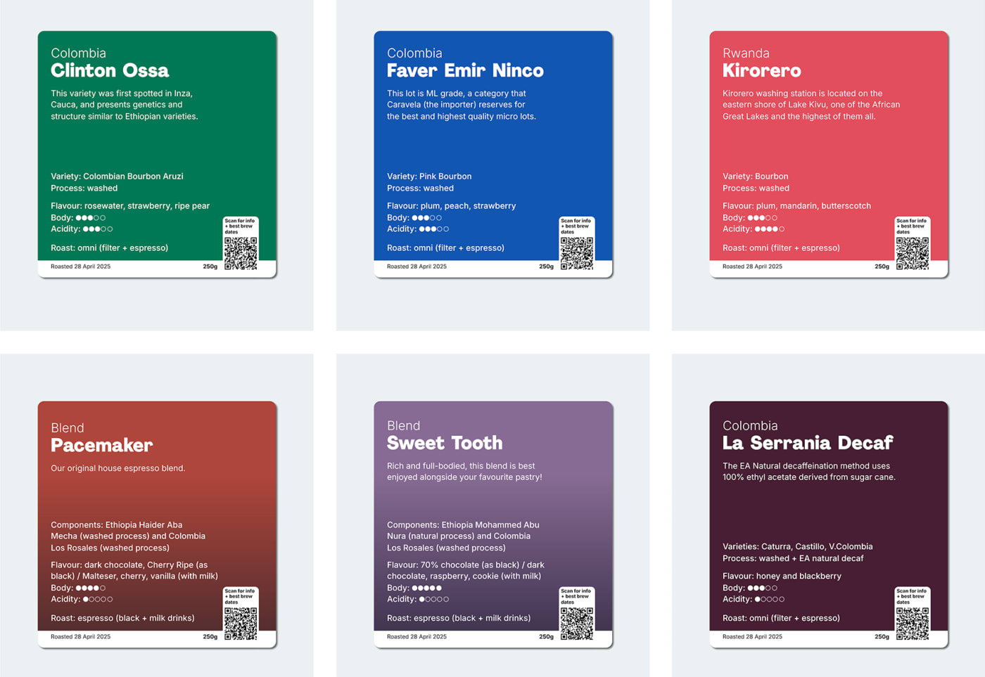
A selection of our new bag labels
So, we’ve introduced a minor design upgrade that (hopefully) makes it easier for shelf-hunters to understand and choose their favourite coffee:
We’ve limited the freestyle blurb to 3 lines maximum, forcing us to be selective and succinct in how we use our words
Variety, process method, flavour suggestions, body, acidity and roast style descriptors are always in the same place and easily spottable
Blends get an alternative structure, with components and flavours also easily legible (and a fancy gradient background colour that sets them apart from the singles)
And our QR code continues in place to give you ALL the transparency info we have about each lot (plus specific best brewing window dates for each bag, based on their roast date)
They’re only tiny changes that we believe will help everyone get to know and choose their coffee with confidence.
Always thinking. Always evolving. Always growing.
See our original post shared on Instagram: