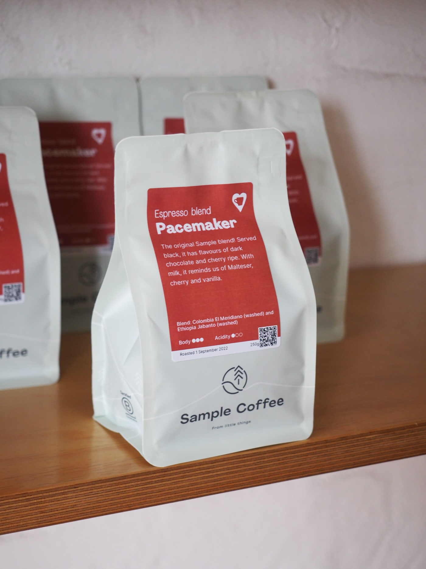
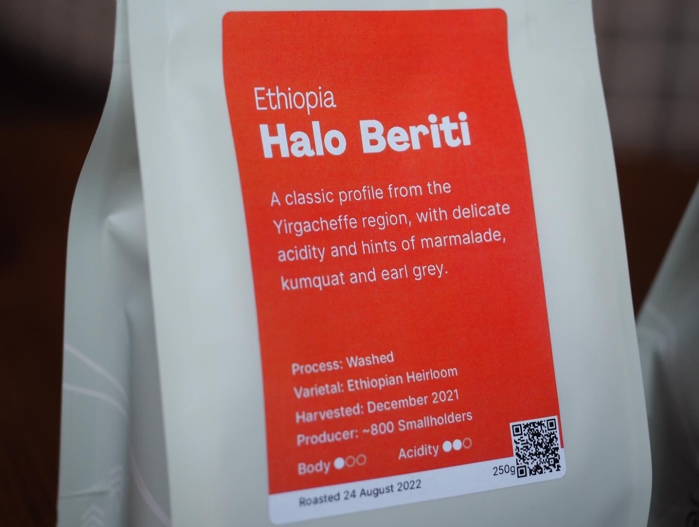
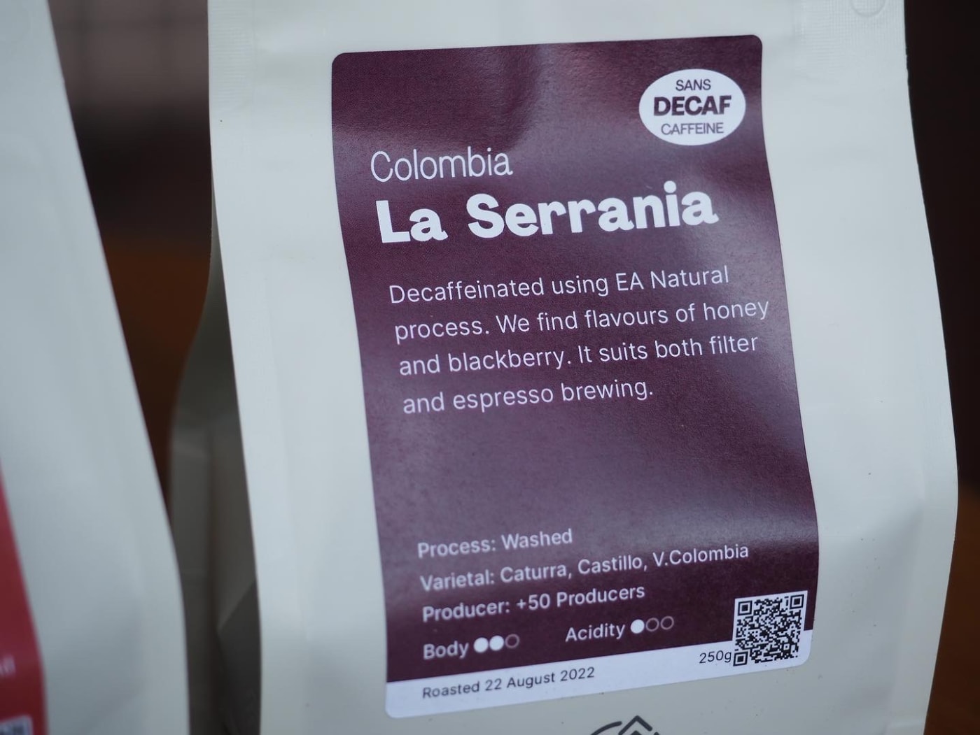
Many customers get their coffee from our cafes or partner venues. Sometimes, there are up to 7 different origins at a time, plus blends and decaf. Unlike online, the space to communicate through our packaging is limited by the boundaries of our classic rectangular Xero labels (which we print in-house every roast day).
A few months ago, Head Roaster John K felt we could improve their consistency and clarity. Plus, he thought we needed some flexibility to potentially talk about details that made a lot unique or what was important to us. Soon after, the team started moving threads, including a survey many of you participated in—thanks heaps for that.
The new design has been going around for a couple of weeks now. It’s sleek, practical and meaningful.
Blends, decaf and single origins present with the same format, something we think it’s cool because it puts them at the same level of ‘importance’ while on the shelf.
How the information is laid out brings more clarity and room for creative expression. The paragraph in the middle is a free-form space where our roasters can express their thoughts about each coffee: flavour, cupping presence or maybe something special about that lot or producers’ story. On the other hand, the list at the bottom collects all the objective features (process, varietal, altitude, etc.), making it easy to understand and compare.
It’s just a tiny change, but a good one. What do you reckon? Always keen to hear—and evolve.
From little things…